ML-LAB-VI-SEM
Exercise 02
Study of Python Libraries for ML Applications such as Pandas and Matplotlib
Aim
To explore and experiment with Python libraries Pandas and Matplotlib, which are commonly used in Machine Learning applications.
Procedure/Program
Pandas Example:
import pandas as pd

# sample dataset
data = {
    "Name": ["Alice", "Bob", "Charlie", "David"],
    "Age": [25, 30, 35, 40],
    "Salary": [50000, 60000, 70000, 80000]
}

# DataFrame
df = pd.DataFrame(data)

print("DataFrame:\n", df)

# basic operations
print("\nDescriptive Statistics:\n", df.describe())
print("\nSelecting Age Column:\n", df["Age"])
print("\nFiltering Rows where Age > 30:\n", df[df["Age"] > 30])
Matplotlib Example:
import matplotlib.pyplot as plt

# sample data
names = ["Alice", "Bob", "Charlie", "David"]
salaries = [50000, 60000, 70000, 80000]

# bar chart
plt.bar(names, salaries, color=['blue', 'orange', 'green', 'red'])
plt.xlabel("Employees")
plt.ylabel("Salary")
plt.title("Employee Salary Chart")
plt.show()
Output/Explanation
-
Output:
The program demonstrates basic functionalities of Pandas and Matplotlib. Expected outputs:Pandas Output:
DataFrame:
      Name  Age  Salary
0    Alice   25   50000
1      Bob   30   60000
2  Charlie   35   70000
3    David   40   80000

Descriptive Statistics:
            Age        Salary
count   4.000000      4.000000
mean   32.500000  65000.000000
std     6.454972  12909.944487
min    25.000000  50000.000000
25%    28.750000  57500.000000
50%    32.500000  65000.000000
75%    36.250000  72500.000000
max    40.000000  80000.000000

Selecting Age Column:
0    25
1    30
2    35
3    40
Name: Age, dtype: int64

Filtering Rows where Age > 30:
       Name  Age  Salary
2  Charlie   35   70000
3    David   40   80000
Matplotlib Output:
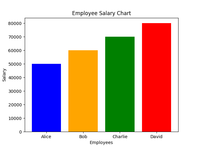
- A bar chart displaying employee names on the x-axis and their salaries on the y-axis.
-
Explanation:
- Pandas provides functionalities for data manipulation and analysis.
- Matplotlib is used for data visualization, helping to represent trends and patterns graphically.
- The Pandas example demonstrates DataFrame creation, data selection, and basic analysis.
- The Matplotlib example showcases how to create a simple bar chart.